

What a High-Performing Fitness Studio Website Actually Looks Like
Most studio owners can tell when a website feels off. What's harder is naming exactly why, or knowing what "good" is actually supposed to look like. It's not about flash. The websites that consistently turn visitors into booked clients tend to share the same handful of traits, and none of them require a huge budget to get right.
Here's what to check for.
1. It Loads Fast
Every extra second a page takes to load costs you visitors, and mobile visitors leave even faster than desktop ones. Heavy, uncompressed images and bloated page builders are the most common culprits on studio sites. A fast site is the baseline that lets everything else on this list actually get seen.
2. It Works on Mobile First
Most people finding your studio for the first time are doing it from a phone, often while standing outside a class they're curious about or scrolling during a commute. If your schedule is hard to tap through, your text runs off the screen, or your booking button is buried, you lose that person before they ever see what makes your studio worth choosing.
3. The Class Schedule and Booking Are Obvious
A visitor should never have to hunt for how to take a class. The schedule and the booking link belong somewhere visible, within the first screen a visitor sees. If your studio uses a separate booking platform, the link from your website to that platform should be immediate and unmistakable.
4. It Uses Real Photos
Stock photography is one of the fastest ways to make a studio feel generic and interchangeable. Real photos of your actual space, your instructors, and your classes in motion tell a visitor this is a real place with a real community, and they do more to build trust in five seconds than any paragraph of copy.
5. It's Built for Local Search and AEO
A studio website needs to be findable as well as presentable. That means the technical basics: your studio's name, address, and phone number consistent across your site and Google Business Profile, location-specific pages if you serve more than one town, and content structured in a way that answer engines like ChatGPT and Google AI Overviews (AEO, or Answer Engine Optimization, how your studio appears when someone asks an AI assistant for a recommendation) can actually read and recommend. A beautiful site that search engines and AI tools can't parse is still invisible to the people searching.
6. It Has One Clear Next Step
Every page should answer one question for the visitor: what do I do now? Book a class, claim an intro offer, download a resource, contact the studio. Sites that try to do everything at once, with five competing calls to action, tend to convert less than sites with one obvious path forward.
7. It Tells the Studio's Actual Story
Instructor bios, studio philosophy, what makes your class formats different, why you started the studio in the first place. This is the content that turns a visitor comparing three studios in the same town into someone who feels like they already know you before they walk in. It's also the content that's hardest to templatize, which is exactly why it matters.
8. It's Kept Current
A site with photos from years ago, a schedule that no longer matches reality, or a page still referencing a promotion that ended last spring quietly tells visitors the business behind it might not be either. Regular, small updates matter more than one big rebuild every five years.
Seeing It In Practice
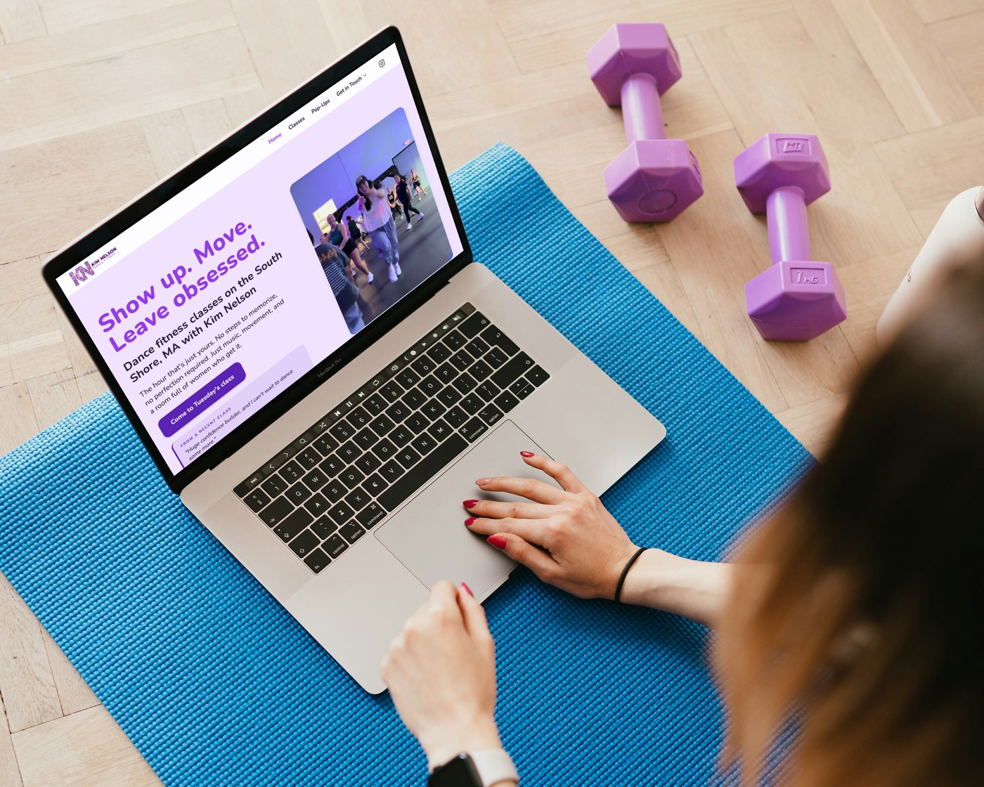 Kim Nelson Dance Fitness, our own proof of concept, built around the same principles above: fast, mobile-first, real photos, and one clear next step.
The Bottom Line
None of this requires a total overhaul. Most studio websites are missing only two or three of these eight pieces. The fastest way to know which ones is to look at your site the way a first-time visitor would, ideally on a phone, with fresh eyes.
If you want a full rundown of the most common gaps, we built a checklist covering the ways a studio website quietly loses members without anyone noticing.
Download: 10 Signs Your Studio Website Is Costing You Members →
And if you'd rather have someone else run through it for you, that's exactly what an audit is for.
A Waveform Digital Presence Audit reviews your website, your local search presence, and the gap between where you are and where you should be.
Waveform Marketing is a boutique digital agency on the South Shore of Massachusetts, specializing in fitness studios and wellness centers.